Thursday, 22 March 2012

Exam Unit- 1st Idea: Sports experiences

Delly Carr Inspiration Analysis

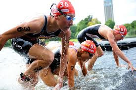
Delly Carr is one of the most famous sports photographers. He lives in Australia. His current work has been featured in promotional companies as diverse as Oakley, Kelloggs, Nikon, Speedo and Red Bull. He is also accredited to photograph most, if not all, of the major sporting events and competitions in the country such as the past four Commonwealth Games and the Sydney 2000, 2004, 2008, 2010 and 2012 London Olympic Games He is probably best known world wide for his work in the sport of Triathlon. 


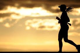
MEANING AND AESTHETICS: Each picture is filled with space, there isn't any sense of emptiness this shows that the pictures represent the determination of the people, they don't quit they finish every race. There wouldn't be any difference if the scale of work would be bigger or smaller as it wouldn't change anything. The tones he uses suit the contrast and make every colour stand out form each other even the black and white photos. The composition of these photos is designed- it shows the best moments of the people doing the sports, there isn't any negativity in the picture in only shows their hard work and determination. Each photo shows different colours which means that the photos he takes are taken in different time of the day meaning that the people in it work out hard every day no matter what's the weather or time. The first picture was taken in the evening maybe meaning that the person never goes to sleep without working out she works hard to get to the goals she is aiming at. The middle picture is taken during a sports game you can see that the people in it are very focused on what they are doing. The last photo is in black and white to show that even without the colours the hard work and determination can be seen. 
PERSONAL RESPONSE: I really like his photos because it shows true determination of the people doing the sports , he always choses the right moments to take the photo. His photos show hard work and positivity there is no bad things in his photos, there is just pure concentration. I also like how the photos are taken in different times of the day not only while the games or olympics are on, it shows how the people work towards their goals not just the achievements. 

My Sports Photography - Karol Tomaszewski


My Sports Photography- Blazej Gdaniec


These are my Delly Carr inspired photos of sports, I took the in the gym during my boyfriends and my friends workout. I chose to do this because it links with experiences, they are doing something different then always, also during the workout they experience pain, burning and sweat during their time at the gym showing their determination and hard work. They are working hard towards where they wanna get and they focus on what their are doing. It was also my first experience watching them work out, which was really interesting because when it comes to the gym they are totally two different people, they are really focused and their concentration shows how much they wanna get to their aims- they don't laugh or talk like they do on a normal day they are more serious which shows their courage in what they do.  


Monday, 19 March 2012

Exam Unit Intro- Life Cycle Photography

  Bill Viola- The Nantes Triptych


AESTHETICS and MEANING: The space in the picture is big, between every image there is a black gap which I think it means that before you get to that next period of your life shown you will experience and live a whole life before it destroys you. The image would be different if it would be smaller because if the gap wouldn't be there then it would seem that there is nothing you will experience in life and these are the only steps, the sense of gaps shows that people will live for a long time before death. There isn't really any elements used only water which indicates movement, this links to life because we move forward every day, we can't go back and change our past. The composition of the photo was designed, the different parts of the image relate to each other because it shows the stages of your life, birth, struggle ( the water may indicate the many stages of life you have to go through to get to where you want to) and death. The image was made by shooting a film by showing different stages of life till it got into to the end bit: death. The colours these images show are very different for each bit, at first the picture of the baby shows very peachy colours as well as natural, this means that it is very peaceful and alive. The second image shows a person in water using very deep blues and blacks which could indicate calmness, struggle and pain because blue is  very cold, misunderstanding colour. The final images uses very grey and dull colours because it links with death, this is the sad part of life thats why it is using these colours. 
PERSONAL RESPONSE: For me this photo is really inspiring because it shows the Life Cycle, it shows each stage how it is suppose to be shown with the use of the right colour, in some ways the photo is emotional because this is the real stage of life and we can't change that and it always ends with death which is painful for a lot of people. Looking at the baby image it brings me back memories of when I was little and enjoyed my life by just playing around and now it's different- as we get older there is more obstacles in life and it gets harder. 

Exam Intro- Life Cycle My Photography

These are some of my photos linked to the Life Cycle, I chose to do these photos based on the season: winter, this links to Life Cycle because seasons change and in each season people dress differently and do different things like play in the snow. The photos below show winter fashion: scarfs, fur coat and also playing around in the snow: snow ball fighting. The first image shows a ghostly figure behind her, I've done this because I think that in winter it's very cold and it gets dark faster then in other seasons it also seems more scary and dull and I think that's the time where ghost link the most. 


Andy Goldsworthy Analysis


Andy Goldsworthy was born in Cheshire in 1956 and was brought up in Yorkshire. He studied at Bradford college (1974-75) and Preston Polytechnic (1975-78). Throughout his career most of Goldsworthy's work has been made in the open air, in places as diverse as the Lake District, Grize Fiord in Canada, as well as Japan and Australia. The materials he uses are those to hand in the remote locations he visits; twigs, leaves, stones, snow and ice. Most works are ephemeral but demonstrate, in their short life, Goldsworthy's extraordinary  sense of play and of place.

Analysis: His work is demonstrated in such a creative way, showing nature in abstract and weird way makes it look like nature is very mysterious. The photos show that nature is never the same and in each and every place you can find something new and beautiful. Andy uses his photography skills to create something  totally different from nature, he makes it look like something form a dream and uses every single space in the picture to make the photos look busy. I really like his work because he makes nature look like it is out of space- something you can't find on Earth even though it's actually here. He never takes boring photos he always tries to find the most abstract and different things to take photos of to make it look magical.  


Winter Time Photography- My photos

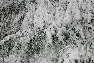
These photos were taken by me in Forestdale Forest twenty minutes away from my house. I decided to take these photos during winter time because I thing during this time everything looks so magical, the way the twigs and trees are covered in a snow making it look like a dream and also the way snow sparkles like some magical crystal. There is a photo of when the snow was falling of the tree which I think looks very interesting because of the way it makes it look kind of smokey and windy. Each tree looks so different with the snow on top of it. Winter is one of my favourite times of year and I think that this photos show my personality in some ways showing my peaceful and calm side and also surprising.  These were taken with my SLR camera with a nikon lens without a tripod.  


Thursday, 15 March 2012

Geraldine Georges Analysis

    Inspirational Photo Analysis - Exam Unit

Geraldine Georges


About the artist: 

 Belgian graphic designer and artist Geraldine Georges captures the sultriness of a woman  through her unique pieces of art. She combines dramatic black lines, striking photographs  of women and fanciful images of nature to provide layered pieces. It's as if Georges uses   
the mixture of mediums to symbolize girls caught in between two different worlds.
She uses a wonderful and sophisticated blend of illustration and photography. 
Her work is often abstract of the female form, captures the eye and imagination. Influences of fashion and couture flow throught her wonderful pieces.


AESTHETICS and MEANING: The use of colours in this photo is very neutral, it uses soft colours like cream, white, light shades of brown and some black. These colours can be describes as earthy and nature which she actually uses in the photo showing the part of the tree and birds where her eyes suppose to be. Her skin colour is very pale which could indicate lack of daylight and maybe she is nervous or stressed about something. I think she chose to do the nature objects in ink because because it is dark in colour, the lady doesn't seem to be comfortable with herself ( she is hiding her face with her hands) , the ink indicates that she is trying to blacken her world. The composition was designed: it was to show the woman's nervousness, the meaning behind it could be that she fears the world or she doesn't what to be seen or judged by the world. It looks like she is hiding her emotions and tries to show them only by nature as the ink drops from her eyes like tears which than creates the tree. The tree could be a meaning of peace, she is trying to find it  but find it difficult that's why it is blackened. The tree could also show magical associations meaning that she has her own imaginary world and she wants to keep it like that. The birds where her eyes suppose to be could symbolise removal from the world, she has no concerns or regrets she is free in her own mind, it could also indicate peace. The colours in this photo were used emotionally the shades of soft colours showing classical side, the colour black represents misunderstanding but also her elegance. This means that she is seen as a very delicate person in the world but also very mysterious and hard to figure out which adds a bit of edginess to her.   
PERSONAL RESPONSE: I really like this photo because it represents more than one thing. It represents fashion, elegance, confusion and misunderstanding of how people can view you in the world. I also like how her work show a lot of purity yet so much detail. There is also a perfect colour combination between the soft shades of earthy colours and the black ink. I think that her digital art is very skilful and amazing. Her work shows the calm side of females and the very specific detail means that woman have a lot to show for themselves, she tries to say that each woman is beautiful and has something very important in her personality but they don't always want to reveal that. Her work definitely inspires me and for the exam theme i will be very happy to be taking photos in her style and combining art and photography the way she did.  


MY INSPIRATIONAL PHOTOS


Tuesday, 13 March 2012

Photography- Exam Unit

Exam Unit Mind Map


Exam Unit- Initial Ideas


1. Relationships: meeting new people, falling in love, meeting a stranger- I will be taking a series of photos showing love relationships, showing people meeting, falling in love and kissing, this links to the theme because it's meeting people and experiencing things in life.
2. My second idea will be showing sports: boxing- gloves meeting the face, experiencing new sports and something new in life.
3. ghosts experiences, taking photos and that playing around on the photoshop making it look scary and ghostly-like.
4. Final exam Idea: five senses experiences. 

 Rankin Destroy Project Analysis


Rankin took his photography to the wider market, creating landmark editorial and advertising campaigns. His body of work features some of the most celebrated publications, biggest brands and pioneering charities, including Nike, Swatch, Dove, Pantene, Diageo, Women’s Aid, and Breakthrough Breast Cancer. He has shot covers for Elle, German Vogue, Harpers Bazaar, Esquire and GQ, and worked with Rolling Stone and Wonderland. His work has always endeavoured to question social norms and ideas of beauty.
In 2001, Jefferson and Rankin launched AnOther Magazine. With a focus on fashion, originality, and distinction, the magazine has become one of the most recognised and highly esteemed fashion magazines in the world. Rankin became known for his portraiture of bands, artists, supermodels and politicians. Having photographed everyone from the Queen of England to the Queen of Pop, Rankin is often seen as a celebrity photographer.


Rankin started drawing various symbols for god, love, hate, infinity, then he took the picture to Simon, who started cutting away bits of his face. But Matt Maitland, who was designing our album artwork, told them they were being too reverential, and started adding new ‘Jaxx characters’, incorporating human and animal parts. 


 In this image a third dimension was used , he didn't really wanna destroy this image , rather he wanted to show an abstract side of him. 


He printed this image and kept it in his room for about a week. Each day he stuck with a glue something new to this photo creating the final image.

AESTHETICS: This images show an interesting way of  which show a different side of the celebrities. It also makes the photos look very energetic and funky due to the way things have been stuck and moved. In the first image the edit shows funky colours like purple, red and energetic blues which pulls different characters which links to the music they create, it shows different dimensions showing that it isn't just human. 
The second image uses darker colours and there is an interesting use of light in it. As you can see it was't really destroyed making it funky, it rather shows and abstract side of human something like an alien, it shows a side of him that might be a bit weird and different form others which I think is really interesting because it shows that not everyone is the same. 
The third image is more of a glamour fashion show, he added lots of stuff to it like jelly babies and feathers to make the photo look colourful and fashionable. It also shows that not all fashion has to be serious it can be fun, crazy and weird.
MEANING: The meaning of these photos is to show that photography can be taken to the next level and create fun and crazy images by editing, it shows that photography isn't just about taking good photos but also experimenting with different objects, materials, and options as well as photoshop. 
PERSONAL RESPONSE: I think these photos look really great and are very funky in terms of editing. It shows a big range of materials and editing skills which I think are very important because it makes the photos look more interesting. I also think that each image has a specific meaning behind it , showing the different side of celebrities, it adds up that everyone is different and everyone has some abstract things about them.


PATRCK ROCHON- MY INSPIRATIONAL PHOTOS


The idea started by taking photos of myself on the computer. I then went off and printed out the photos and in lesson we had some interesting materials like coloured paper, markers, ink and wires. Using these stuff I painted, drew and stuck on top of the printed pictures creating some prints and interesting shapes, I then took new photos and played around on the photoshop with the colour and blurry effect. I really like the photos because they are different then just normal photography but it also shows my funky, wild side. I really enjoyed doing this in lessons it was really fun and a great experience. I learnt some new techniques like colour blending and mixing but also experimenting more with my photos, I learnt that i don't always have to keep my photos normal - I can make them odd and show another side of my personality and characteristics and also show my abstract side.