Exam Review:
How have your original ideas / concepts changed from the start of the project?
My final idea changed a lot from my first idea because at the beginning I wanted to do 'Sports Experiences' and at the end I chose to do "Five Senses". I think that I chose the right idea because it gives more options and I can take variety of photos for it which I think will be more effective.
How have your original ideas developed through experimenting with techniques, materials and equipment?
My ideas developed in a more effective and interesting way because before the experiments I only had few simple SLR camera photos and film negatives. After the experiments my photos have developed because I had more options like: reversals, joining negatives together, photoshop experiments like artistic cutout, selected colour, water effect and also splatter spray. It gave me a lot of brief ideas for my final outcome.
How have your original ideas developed as a result of researching the work of others?
My final ideas haven't really developed through looking at artists because in the exam I wanted to be more independent and just do my ideas rather then having it influenced by others. However, the artists I looked at, did gave a bit of help in my experimentation because they showed my that my photos don't have to be simple, they can be fun and original.
Do you think your ideas will continue to change and develop as your work progresses? Do you have any further experimenting / research to do that you think might change / improve your ideas?
Yes my work will change because I think that every time I do something and finish it , I review it and I know that I can do better and make it more effective so at the end I always add some things and experiment a bit more with different techniques. I have no longer any more experiments to do as I tried everything that I wanted out.
EXAM EVALUATION:
Before the exam I prepared everything that I needed, this includes: taking photos, getting materials like the sketch book and stuff to stick in my book and also printing out digital photos. I also planned everything out so that on the exam I won't be confused and I know what I will be doing in the right order so that I can finish on time.
Before the exam I also did a lot of experiments in the darkroom and using photoshop so that I can have an experience with everything and so that I can learn new skills which was very helpful during exam because my final outcome shows a range of experiments and not every photo is simple which I think is good because it shows that I can do a lot of skilful things in photography not just few, simple ones.
My final outcome was a sketchbook that looked like a photo album/ book . What I did was take photos of all five senses and what links with it. When i took the photos I edited the digital ones before printing them out and I developed my negatives in the darkroom during the exam. The rest of the exam consisted of me sticking the photos in making them more effective by adding few more edits, sticking things in like materials so that there is an artistic side of the book and finally painting,writing and drawing stuff in so that it doesn't have any blank pages.
The artists that influenced me during my exam was Rankin and Gerdline Georges because they showed me that photos don't have to be boring and simple but they can have an artistic side and that you can add drawings and other materials to your photos to make them unique. Without looking at these artists I wouldn't have that much knowledge that I have now and I wouldn't get as far as I did with my exam experimentation and final outcome.
I think that my final outcome came out really good because I did everything that I planned doing. It is not simple, it has an artistic side to it so it shows bigger range of skills. I am happy with my final outcome as it is effective and original from all the other work and this is was I was aiming for.
If i had time to improve my work I would edit more of my photos to make them more unique and effective as some of the photos are a bit simple and not in focus. I would also add more art materials as some of the photos seem to be a bit blank.
This is my photography blog for AS Photography which I am currently studying in Coulson College. This is my work for all my prjects during the year 2011-12. I hope you enjoy the work you see here.
Friday, 4 May 2012
Thursday, 3 May 2012
Adobe Photoshop Experiments
Adobe Photoshop Experiments
Original Image:
PHOTOSHOP EDITS:
This was an experiment to make my photos look like a comic or a acrylic painting. I edited these photos using photoshop using the hue/saturation adjustments and also the filter-artistic-cutout options. I think it looks interesting because the effect gives it a nice look especially with the colours. I will be using this technique in these photos during my exam to put in my made-up book.
Original Image:
PHOTOSHOP EDIT:
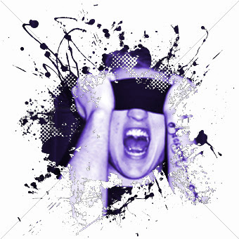
This was also done using Photoshop, I edited by getting an image form google of the black splatter spray, then I got one of my black and white images and colorised it to make it look purple-bluey colour. I then combined these two images together so that my image is in the middle of the splatter. Before i did this, I had to make my image smaller so that you can see the screaming face exactly in the middle. I think that this was an interesting thing to experiment on because it was fun and the final outcome came out great. It is effective because it can be used in a lot of things like photos, posters and film/cd covers.
I will be using this image in my exam.
ORIGINAL IMAGE:
PHOTOSHOP EDIT:
ORIGINAL IMAGE:
PHOTOSHOP EDIT:
This was a fun experiment of making bits of of my coloured and making the rest black and white. The second image is also blurred out so that the final effect is more interesting and so that the focus can be only on the colour bit. I enjoyed doing this experiment because it helped me explore more options and what I can do to make my photos a bit more interesting and effective. I edited these photos using Photoshop by turning my image black and white and then selecting few things to make them in colour. I will be using these photos during my exam.
ORIGINAL IMAGE:
PHOTOSHOP EDIT:
This is another artistic cutout that I did using Photoshop. In my opinion the cutout looks better then the original photo because it gives it an interesting outlook and contrast. The pink also indicates love and as you can see there is more shades of in the edited photo rather than the original. I am going to use this photo in my exam.
ORIGINAL IMAGE:
PHOTOSHOP EDIT:
ORIGINAL IMAGE:
PHOTOSHOP EDIT:
These photos were blurred out to give them and interesting water effect. I like them because the focus is only on one part of the picture which makes you focus only on that. the blurred effect also looks good because it makes the photo look mysterious, like you don't know what is behind it.
Overall, I enjoyed doing these experiments because I have learnt new skills. It also helped to make my photos look more effective and interesting which is a good thing. The photoshop experiment gave me idea that not all my photos have to look simple. It also gave me experience so that I know what I will be doing for my final exam.
Monday, 30 April 2012
Five Senses- Darkroom Experimentation
These photos show my development of ideas and my darkroom experimentations. I did the experiments so that I know which techniques to use during my exam but also so that I know which photos look best. The experiments that I did include: reversals, different time setting and joining negatives together. I think that the experiments came out effectively because I know which technique is good to use and what should I do to make them look as best as I can without them looking boring or unoriginal.
1. Different time settings.
This was the first time setting. It came out a bit too dark for me so I decided to put the filter up a little bit more and put the time down by few mili-seconds so that it is a bit brighter and lighter
This is the second attempt. It came out a lot nicer than the first one because there is more contrast and the flower looks more clear when it is brighter. I wrote down the time, filter and lighting type so that I can remember it for the exam.
2. Time setting and reversal.
This image shows my first attempt for timing, it looks good however I wanted it to only have focus on one side of the face rather then the whole face so I decided to put the filter up and also the exposure time.
This was my second attempt and for me it looks better because like I wanted, the focus is only on one side of the face because of the shadow showing part of five senses like nose, eyes and mouth. The flowers also look like they have more detail and look more clear.
REVERSAL
This is a reversal for this image which came out looking interesting because the figure in this picture looks ghostly and the flowers instead of being white are black making them look more unique and mysterious. I think that this is a very interesting technique because it looks different and can be used in many types of photos. For the exam I will be using this technique on some of my negatives.
3. Reversal
This is how the original photo looks like before the reversal. It looks very natural and her eyes came out very contrasty and toned which I really like.
This is the reversal for this photo. I don't like the way it came out because you can't see any features of her face and there is no focus on her eyes like there should be. Also the flowers look very simple and you can't really tell that they are flowers but more like leafs. The reversal looks like something went wrong during the process. I like the photo more when it is all natural.
4. Joining negatives together
This is the original photo before it was joined together with the other negative.
This is how the photo looked after putting another negative on it. I think it looks very effective because it doesn't look blurry but it looks like it is moving creating a ghostly effect once again. However, I did not exposed it for long enough so next time I do this I have to make sure that the time exposure is long enough.
5. JOINING NEGATIVES TOGETHER
This is a photo of two negatives joined together. I think that it came out looking effectively because...
Thursday, 26 April 2012
Exam Unit: Five Senses First Film
This darkroom film shows some of the photos that I will be using for my exam. It shows the theme of 'Five Senses' like eyes, touch and smell. I did it outside college near the Coulsdon church. There was a lovely tree there so I thought it was a good idea to take photos there that could relate to the project I will be doing. The photos were taken by a film camera and developed in the darkroom. Some of the photos came out either too light or too dark so I experimented in the darkroom to make sure this mistake won't happen during my exam. With the last photo I experimented a bit more; I took two different negatives and put one on top of another, I think it came out effectively that's why I will be using this technique during my exam.
Tuesday, 24 April 2012
My Target Grades
My minimum target grade for AS Photography is C/B.
I should not get anything below a C as this is my ALIS target grade.
I''m hoping to get a B as my final grade.
I should not get anything below a C as this is my ALIS target grade.
I''m hoping to get a B as my final grade.
Tuesday, 17 April 2012
FINAL EXAM PLAN
MY FINAL EXAM PLAN- EXPERIENCE: FIVE SENSES
This slides show my final exam ideas and what I am going to be doing for each chapter and what kind of photos i will be taking. I will have to experiment imaginatively with these photos like going to a darkroom and doing multiple exposures, reflecting and reversals and make some of my prints textured.
TARGETS
TARGET SETTING QUESTIONNAIRE
Have you taken a broad range of primary photographs for your exam theme such as digital AND film photographs? Are these on your blog?
I HAVE TAKEN BOTH DIGITAL AND FILM PHOTOS FOR MY EXAM, HOWEVER I DIDN'T FINISH TAKING ALL OF THE PHOTOS SO THEY ARE NOT YET UPDATED ON MY BLOG.
Have you explored and developed your ideas imaginatively? How have you demonstrated this?
Have you researched a diverse range of artwork and completed this on your blog? Who have you analysed? Is your analysis in-depth?
YES, I HAVE RESEARCHED BOTH GERALDINE GEORGES AND RANKIN AND ALSO DELLY CARR AND ALL OF THESE ARE ON MY BLOG, I TRIED TO MAKE MY ANALYSIS ALL IN-DEPTH.
Have you experimented with a wide range of techniques both handmade and computer generated? Which techniques have you used?
I HAVE EXPERIMENTED WITH HANDMADE TECHNIQUES LIKE CUTTING OUT PART OF THE PICTURES AND COMPLETING IT WITH INK, MARKER PENS AND COLOURED PAPER, I HAVEN'T YET DONE A LOT OF COMPUTER TECHNIQUES WHICH I WILL DO IN THE NEXT FEW DAYS.
Have you refined / developed your outcomes through experimentation? How?
I HAVE REFINED SOME OF MY PHOTOS HOWEVER I STILL NEED TO TAKE SOME PHOTOS AND EXPERIMENT WITH THEM TO MAKE THEM LOOK MORE IMAGINATIVE AND UNIQUE.
Have you written in detail about your experiments and developments on your blog and used this information to help you improve?
YES, I HAVE ANALYSED ALL MY WORK AND PHOTOS AND WROTE DOWN THE THINGS I NEED TO IMPROVE AND USED THESE INFORMATION TO HELP ME IMPROVE MY WORK NEXT TIME.
Have you taken imaginative leaps/ shown a sense of discovery/ willingness to take risks in your work? If so how? If not, how can you do this?
I HAVE NOT YET SHOWN A SENSE OF DISCOVERY BUT FOR MY FINAL EXAM I WILL BY SHOWING DIFFERENT EXPERIENCES AND SENSE OF DISCOEVRY. FOR EXAMPLE FOR "SIGHT" I WILL BE TAKING PICTURES TO SHOW BLIND PEOPLE AND THEN I WILL MAKE THEM TEXTURED TO SHOW HOW BLIND PEOPLE READ.
Have you shown enthusiasm and imagination in your work? If so, how? If not, how can you make changes to do this?
I THINK I DID, BECAUSE I EXPERIMENTED WITH THE PHOTOS IN A FUN WAY LIKE USING INK AND MARKERS AND CUTTING SOME OF THE PHOTOS OUT. HOWEVER, I NEED TO WORK BACK ON SOME OF THEM AND TAKE IT TO THE NEXT LEVEL FOR EXAMPLE EXPERIMENTING IN A DARKROOM, PUTTING TO PICTURES TOGETHER. IN MY FINAL EXAM THERE WILL BE BROAD RANGE OF IDEAS AND ENTHUSIASM AS EACH CHAPTER WILL SHOW SOMETHING DIFFERENT.
Have you created work that is exciting and original? If so, how? If not, what can you do to improve this area?
IN SOME AREAS I DID, BECAUSE MY IDEA IS DIFFERENT FORM ANY ONE ELSE IN MY AS GROUP, I ALSO THINK IT WILL BE INTERESTING BECAUSE IT WILL SHOW MORE THEN ONE THING, EACH CHAPTER WILL BE ORIGINAL AND EXCITING.
Have you annotated your blog thoroughly throughout?
YES, EACH OF MY POSTS IS ANNOTATED THROUGHLY.
Have you practised with your exam outcomes by creating mock-ups? Are your outcomes skilful/ well constructed?
I HAVE NOT YET PRACTISED WITH MY EXAM OUTCOMES BUT I AM PLANNING TO DO THAT DURING THE NEXT FEW DAYS . MY FINAL OUTCOME WILL BE SKILFUL AND CONSTRUCTED TOGETHER.
Have you created an exam plan?
YES I DID, IT IS POSTED ON MY BLOG ' FINAL EXAM PLAN'
SMART TARGETS:
1. TO PRACTISE THE OUTCOMES OF MY EXAM- E.G. DARKROOM, GETTING MATERIALS I NEED AND PREPARING FOR THE EXAM.
2. TO TAKE FILM AND DIGITAL PHOTOS FOR MY EXAM AND EXPERIMENT WITH THEM.
3. TO COMPLETE MY BLOG WITH ANY MISSING WORK.
Thursday, 22 March 2012
Exam Unit- 1st Idea: Sports experiences
Delly Carr Inspiration Analysis
Delly Carr is one of the most famous sports photographers. He lives in Australia. His current work has been featured in promotional companies as diverse as Oakley, Kelloggs, Nikon, Speedo and Red Bull. He is also accredited to photograph most, if not all, of the major sporting events and competitions in the country such as the past four Commonwealth Games and the Sydney 2000, 2004, 2008, 2010 and 2012 London Olympic Games He is probably best known world wide for his work in the sport of Triathlon.
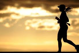
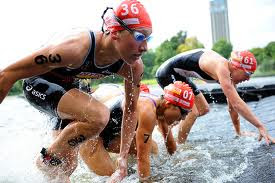
MEANING AND AESTHETICS: Each picture is filled with space, there isn't any sense of emptiness this shows that the pictures represent the determination of the people, they don't quit they finish every race. There wouldn't be any difference if the scale of work would be bigger or smaller as it wouldn't change anything. The tones he uses suit the contrast and make every colour stand out form each other even the black and white photos. The composition of these photos is designed- it shows the best moments of the people doing the sports, there isn't any negativity in the picture in only shows their hard work and determination. Each photo shows different colours which means that the photos he takes are taken in different time of the day meaning that the people in it work out hard every day no matter what's the weather or time. The first picture was taken in the evening maybe meaning that the person never goes to sleep without working out she works hard to get to the goals she is aiming at. The middle picture is taken during a sports game you can see that the people in it are very focused on what they are doing. The last photo is in black and white to show that even without the colours the hard work and determination can be seen.
PERSONAL RESPONSE: I really like his photos because it shows true determination of the people doing the sports , he always choses the right moments to take the photo. His photos show hard work and positivity there is no bad things in his photos, there is just pure concentration. I also like how the photos are taken in different times of the day not only while the games or olympics are on, it shows how the people work towards their goals not just the achievements.
My Sports Photography - Karol Tomaszewski
My Sports Photography- Blazej Gdaniec
These are my Delly Carr inspired photos of sports, I took the in the gym during my boyfriends and my friends workout. I chose to do this because it links with experiences, they are doing something different then always, also during the workout they experience pain, burning and sweat during their time at the gym showing their determination and hard work. They are working hard towards where they wanna get and they focus on what their are doing. It was also my first experience watching them work out, which was really interesting because when it comes to the gym they are totally two different people, they are really focused and their concentration shows how much they wanna get to their aims- they don't laugh or talk like they do on a normal day they are more serious which shows their courage in what they do.
Monday, 19 March 2012
Exam Unit Intro- Life Cycle Photography
Bill Viola- The Nantes Triptych
Analysis: His work is demonstrated in such a creative way, showing nature in abstract and weird way makes it look like nature is very mysterious. The photos show that nature is never the same and in each and every place you can find something new and beautiful. Andy uses his photography skills to create something totally different from nature, he makes it look like something form a dream and uses every single space in the picture to make the photos look busy. I really like his work because he makes nature look like it is out of space- something you can't find on Earth even though it's actually here. He never takes boring photos he always tries to find the most abstract and different things to take photos of to make it look magical.
AESTHETICS and MEANING: The space in the picture is big, between every image there is a black gap which I think it means that before you get to that next period of your life shown you will experience and live a whole life before it destroys you. The image would be different if it would be smaller because if the gap wouldn't be there then it would seem that there is nothing you will experience in life and these are the only steps, the sense of gaps shows that people will live for a long time before death. There isn't really any elements used only water which indicates movement, this links to life because we move forward every day, we can't go back and change our past. The composition of the photo was designed, the different parts of the image relate to each other because it shows the stages of your life, birth, struggle ( the water may indicate the many stages of life you have to go through to get to where you want to) and death. The image was made by shooting a film by showing different stages of life till it got into to the end bit: death. The colours these images show are very different for each bit, at first the picture of the baby shows very peachy colours as well as natural, this means that it is very peaceful and alive. The second image shows a person in water using very deep blues and blacks which could indicate calmness, struggle and pain because blue is very cold, misunderstanding colour. The final images uses very grey and dull colours because it links with death, this is the sad part of life thats why it is using these colours.
PERSONAL RESPONSE: For me this photo is really inspiring because it shows the Life Cycle, it shows each stage how it is suppose to be shown with the use of the right colour, in some ways the photo is emotional because this is the real stage of life and we can't change that and it always ends with death which is painful for a lot of people. Looking at the baby image it brings me back memories of when I was little and enjoyed my life by just playing around and now it's different- as we get older there is more obstacles in life and it gets harder.
Exam Intro- Life Cycle My Photography
These are some of my photos linked to the Life Cycle, I chose to do these photos based on the season: winter, this links to Life Cycle because seasons change and in each season people dress differently and do different things like play in the snow. The photos below show winter fashion: scarfs, fur coat and also playing around in the snow: snow ball fighting. The first image shows a ghostly figure behind her, I've done this because I think that in winter it's very cold and it gets dark faster then in other seasons it also seems more scary and dull and I think that's the time where ghost link the most.
Andy Goldsworthy Analysis
Andy Goldsworthy was born in Cheshire in 1956 and was brought up in Yorkshire. He studied at Bradford college (1974-75) and Preston Polytechnic (1975-78). Throughout his career most of Goldsworthy's work has been made in the open air, in places as diverse as the Lake District, Grize Fiord in Canada, as well as Japan and Australia. The materials he uses are those to hand in the remote locations he visits; twigs, leaves, stones, snow and ice. Most works are ephemeral but demonstrate, in their short life, Goldsworthy's extraordinary sense of play and of place.
Analysis: His work is demonstrated in such a creative way, showing nature in abstract and weird way makes it look like nature is very mysterious. The photos show that nature is never the same and in each and every place you can find something new and beautiful. Andy uses his photography skills to create something totally different from nature, he makes it look like something form a dream and uses every single space in the picture to make the photos look busy. I really like his work because he makes nature look like it is out of space- something you can't find on Earth even though it's actually here. He never takes boring photos he always tries to find the most abstract and different things to take photos of to make it look magical.
Winter Time Photography- My photos
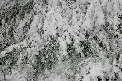
These photos were taken by me in Forestdale Forest twenty minutes away from my house. I decided to take these photos during winter time because I thing during this time everything looks so magical, the way the twigs and trees are covered in a snow making it look like a dream and also the way snow sparkles like some magical crystal. There is a photo of when the snow was falling of the tree which I think looks very interesting because of the way it makes it look kind of smokey and windy. Each tree looks so different with the snow on top of it. Winter is one of my favourite times of year and I think that this photos show my personality in some ways showing my peaceful and calm side and also surprising. These were taken with my SLR camera with a nikon lens without a tripod.

Subscribe to:
Comments (Atom)


